 Tim Griffin
Revisiting the late artist’s exploration of modernist iconographies.
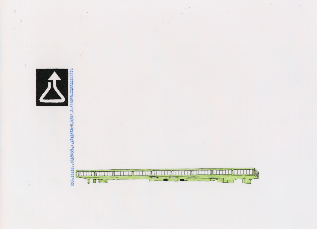
Susan Goldman, from Untitled Logo series, 1999. Ink on vellum, 8 1/2 × 11 inches. Image courtesy Craig Kalpakjian.
To view examples of Susan Goldman’s Untitled Logo series, discussed in this piece, click here and scroll down
• • •
Editor’s note: Given restrictions on visiting museum and gallery exhibitions in person during the coronavirus pandemic, we have offered our contributors the option to reflect on an artwork or body of work that is particularly significant to them and easily viewed online.
• • •
It was around the turn of the millennium that I first encountered the work of Susan Goldman, a young New York–based artist living at the time in Williamsburg. Looking back on traveling to her studio for that visit, I still remember stepping up the subway steps into an area steeped in ambiguous transition. Just a decade or so before, the primary daytime establishment by the stop was the L Café; and now a new economy for the neighborhood was budding all along Bedford Avenue. Even so, around every corner and just a few blocks in any direction, the eroding but persistent infrastructures of previous generations remained. Yet, in a way, this material landscape was perfectly resonant with the work I saw on that initial occasion—which was located, it seemed, palpably, in a kind of historical eddy between paradigms.
Like many other artists at that moment, Goldman was taking up modernist iconographies, both abstract and architectural, in her pictures. Locally and globally, whether in the sculpture of Carol Bove, the painting of Tomma Abts, or the films of Tacita Dean, that specific juncture in art saw a fleeting and sometimes subtle, but pervasive, employing and emptying of modernism’s forms and motifs. The color fields and stark geometries of the early twentieth century would readily find new deployment in artists’ canvases, for example, while mid-century sculptural abstraction was recast time and again in terms of decor. On the one hand, such an impulse, most notably among artists in Europe, corresponded with the recent fall of the Wall—a demise of historical utopian aspirations that rightly drew a generation of artists to revisit and reconsider the similarly failed utopian aspirations of the modernist avant-garde.
On the other hand, and perhaps especially among artists in proximity to Manhattan’s Silicon Alley, such citations of modernism could not be seen apart from a rise of commercial design that divorced this aesthetic from any symbolic program. Here the past was admittedly gone, but only while its lingering signs were being redirected in real time. (One could say that these boomeranged signs of modernism’s cosmopolitanism gave way in design at the very dawn of the digital age—how weirdly retro-futurist that phrase feels today—to the sensibility of capital’s pure circulation.) Taken together, such intermingling currents lent nearly any modernist imagery in art a Janus-like complexion, apparently gesturing toward both past and future.
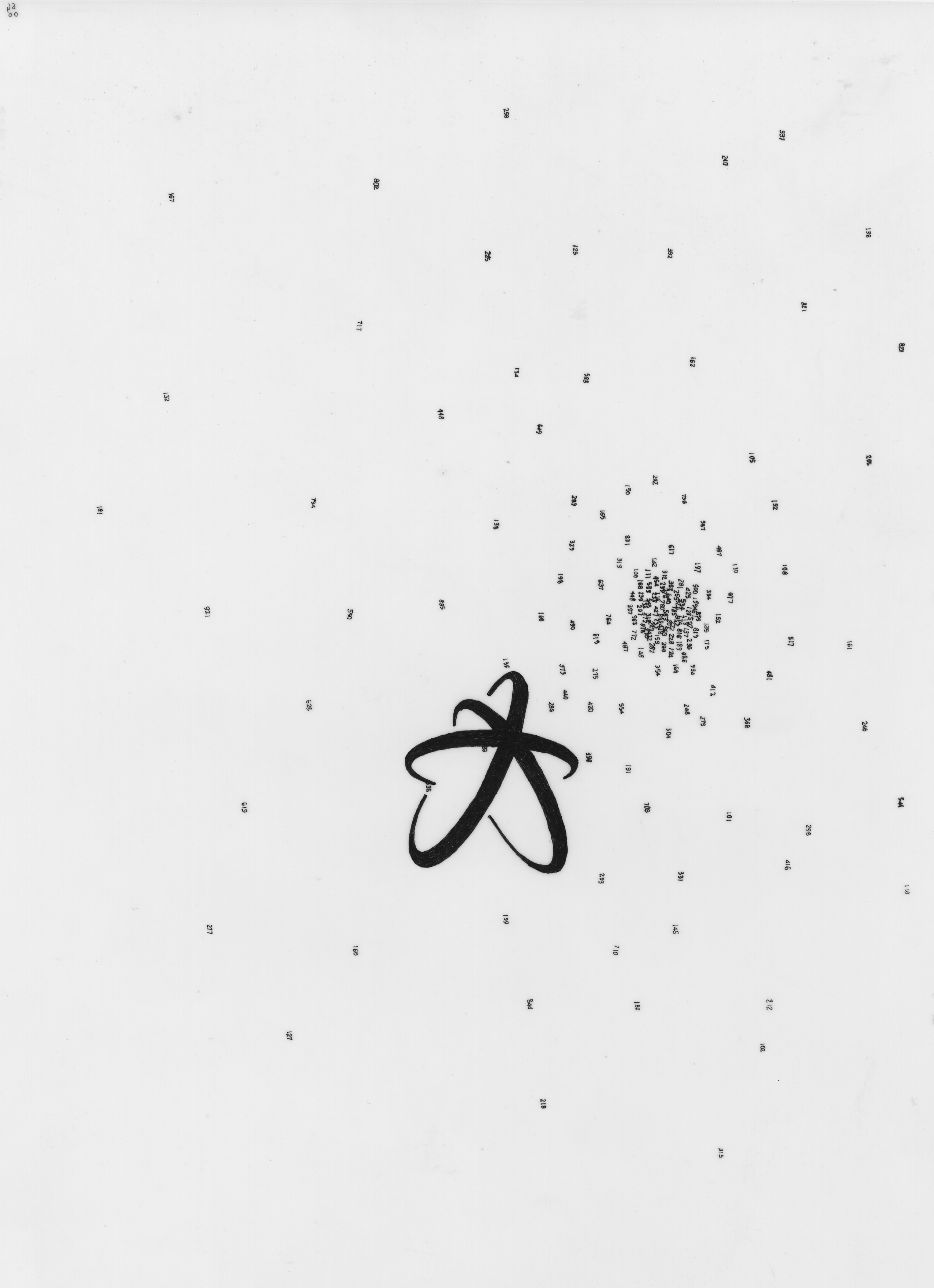
Susan Goldman, from Untitled Logo series, 1999. Ink on vellum, 8 1/2 × 11 inches. Image courtesy Craig Kalpakjian.
Yet Goldman’s approach to this ambivalent temporality was unique, given how her imagery—whether evoking the modern past or aiming at the designed future—was decidedly intimate in its execution and presentation. Hung on her studio wall in grids were ink drawings on sheets of vellum measuring eight and a half by eleven inches—Untitled Logo drawings, she called them—each of which featured small, bright compositions consisting solely of spare, abstract motifs and designs. These various components would frequently feel vaguely familiar, hinting with their stripped-down shapes at this or that corporate signage from different decades, even while they suggested, in cumulative but simplified formal terms, the floating worlds of late Kandinsky. (One prominent critic at the time compared the surprising intimacy of these works to “corporate still lifes.”)
A few compositions also included modern architectures, which was immediately reminiscent of Bauhaus design, but only while creating a doubtful sense that any given figure might just as easily be an ATM kiosk or suburban corporate headquarters. Throughout, Goldman’s drawings refused to settle into place with any fixed identity. In a sense, they summoned memories that never quite arrived—or maybe better, memories that had been already crowded out, and thus eroded, by so many others. And the resulting grasping sensation became explicable, for me, only as Goldman spoke of how the different motifs were, in fact, derived from various corporate logos from recent decades—so her pictures created for any contemporary viewer a full cycle of modernism having been taken over by commerce, but then returned here to its original sea of protean abstraction.
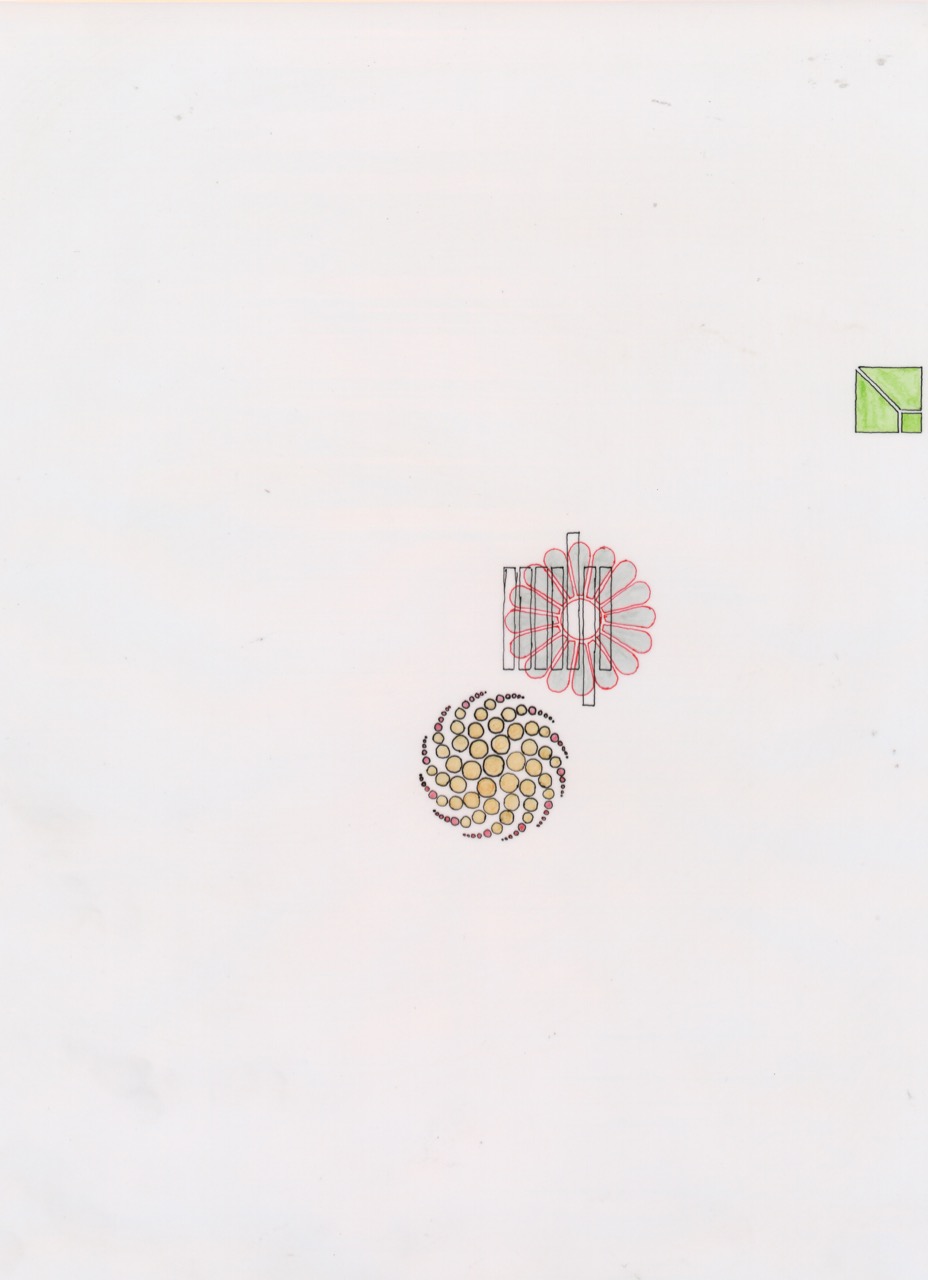
Susan Goldman, from Untitled Logo series, 1999. Ink on vellum, 8 1/2 × 11 inches. Image courtesy Craig Kalpakjian.
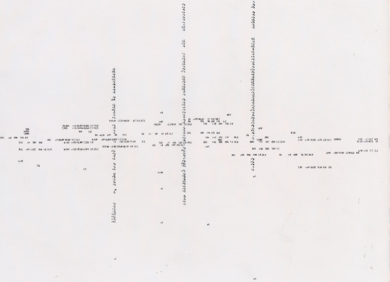
At the time, the example of Gretchen Bender occurred to me as another artist whose work also polished down the found forms of mass-media graphics—indebted to a modern ethos—to grapple with how the fabric of our daily experience (phenomenological and cultural alike) was being rewoven. More provocatively, whereas Bender’s breakneck edits made explicit the terms of an emerging digital technology (with Benjamin’s Arcades remade the stuff of video arcades during the 1980s), Goldman turned back instead to the individual who would subsequently be shaped by such technological forces, creating a sense of quiet introspection and even solitude in the face of them. Notably, in addition to abstractions and architecture, playing across Goldman’s picture surfaces were threads and grids of numbers rendered impossibly small, resembling code or data so barely legible as to seem merely pattern unless one stood within a few inches of the wall. To see these pictures properly, one nearly had to put one’s eye right up against them. And then, if one did linger on any single picture, it possessed allegorical force in its Klee-like scale and sense of immanence and retreat—with the implication that not only objects of the modernist past are disappearing, but also the subject who might behold them. There it was, hinted at, housed modestly in translucent vellum and ink.
Susan Goldman, from Untitled Logo series, 1999. Ink on vellum, 8 1/2 × 11 inches. Image courtesy Craig Kalpakjian.
Years later, one wonders, of course, about that continuing correlation between the disappearance of modernism and that of a certain kind of viewer, and how far removed from Goldman’s counterpoints we are today. Regrettably, we can’t know how Goldman might have mapped this distance from her work’s propositions to the conditions of our current day, as she passed away just a couple of years after our meeting. But the path of her work in the world seems still to magnify the reality and timbre of her subjects: the sense of retreat in her imagery is only underscored by the fact that her work is rarely seen and—as if in a meta-painting—increasingly subject to the very erosion and opacity her pictures describe. To find pieces by the artist, a search online turns up just a single web page with small pop-up windows that feature a number of low-resolution reproductions, unattended by any contextual writing. The galleries with whom she worked have also largely disappeared, with people having gone their different ways.
For me, however, her work is resonant less for such personal disappearances (though anyone in New York and elsewhere knows the feeling now of places shuttering and chapters closing), and more for its underlining how a different gravity for intimate meaning develops with the erosion of contexts, or of regimes of thinking, and of any cultural order. The power of intimacy rises as the world that organizes us begins to fall away. Other pathways come forward among private ruminations undertaken in the face of public things. And this power is all the greater when our public spaces are not so accessible as they once were, and when the very tenability of a public by prior measures seems to hang in the balance. The quiet of Goldman’s work, in its explicit yet anticipatory recognition of the day’s erosions, offers a different promise—a chance to give another meaning to the memories lost in form, and to do this instead of reinscribing the past.
Looking to another time in a different vein, her drawings’ fleeting quality and diminutive scale reminds me of Allan Kaprow’s taking leave from public Happenings, ultimately creating work consisting only of whispers, just barely circulating from one person to another, marking a disappearance that provides through intimate engagements the seed of another language to come.
Tim Griffin is executive director and chief curator of The Kitchen, where he has curated and organized projects with Charles Atlas, Chantal Akerman, ANOHNI, Ralph Lemon, Aki Sasamoto, and many other artists. His writing has appeared in publications such as BOMB, October, and Artforum, where he was previously editor.