 Reinaldo Laddaga
Beyond Pop: a Whitney Museum retrospective offers four decades of the artist’s work.
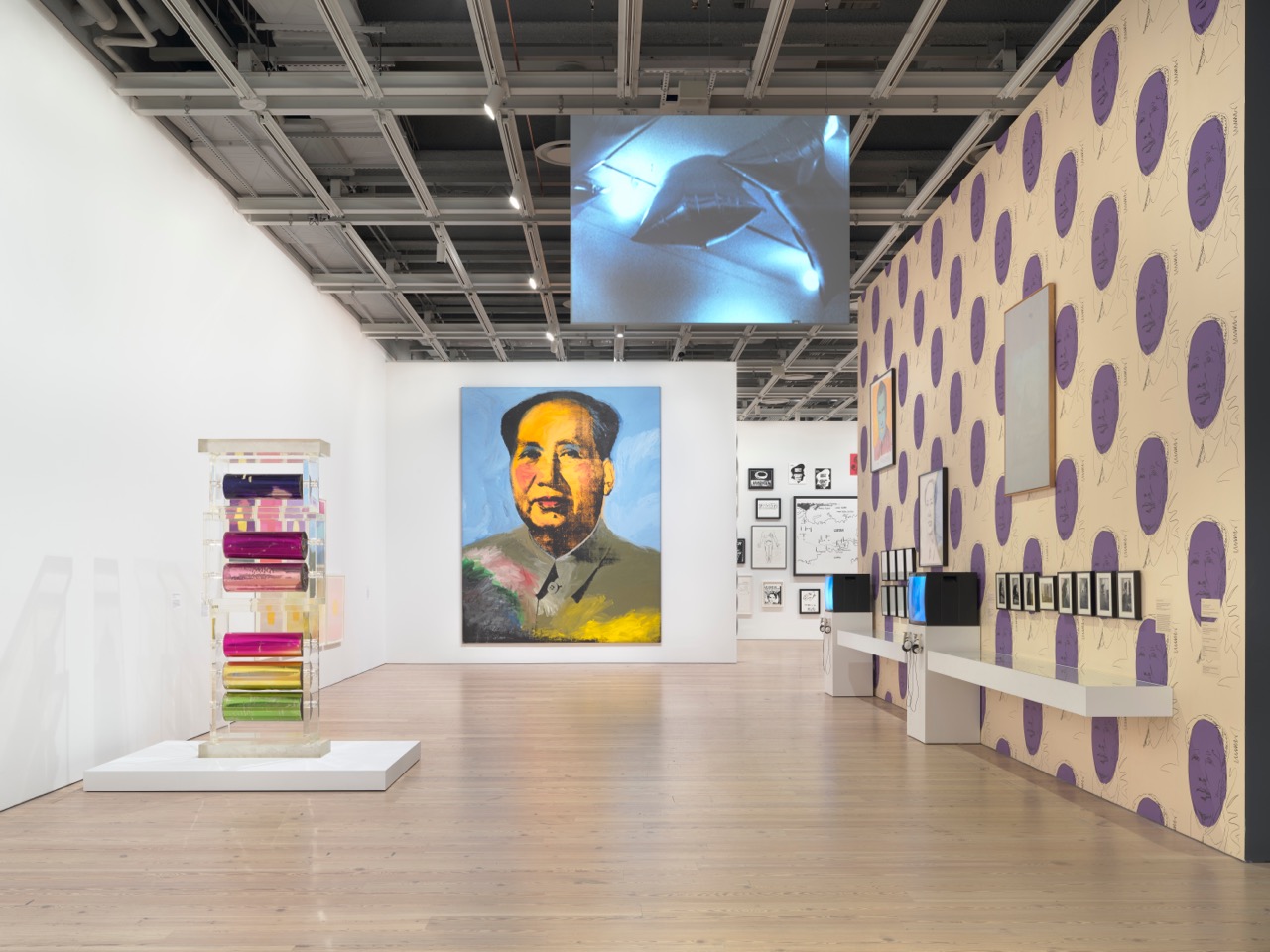
Andy Warhol—From A to B and Back Again, installation view. Photo: Ron Amstutz. © 2018 The Andy Warhol Foundation for the Visual Arts, Inc. / Licensed by Artists Rights Society (ARS).
Andy Warhol—From A to B and Back Again, Whitney Museum of American Art, 99 Gansevoort Street, New York City,
through March 31, 2019
• • •
In an insightful essay in the catalog for Andy Warhol—From A to B and Back Again, Branden Joseph reminds readers that far from having been unfailingly celebrated by the critics and power holders of the institutions of his day, Warhol’s work consistently met with considerable resistance. One particular object of hostility was the aesthetics of visual and aural noise that characterizes Warhol’s work of the second half of the 1960s—most notably his collaboration with the Velvet Underground in the Exploding Plastic Inevitable multimedia shows, but also evident in the film The Chelsea Girls (1966), and in such experiments with the book form as Andy Warhol’s Index (Book) (1967). Joseph concludes: “By continuing to focus almost exclusively on the Warhol of Pop art, including his legacy in the appropriationist strategies of inheritors such as Jeff Koons, Damien Hirst, and Takashi Murakami, art historians risk overlooking the Warhol of ‘white noise’ . . . thereby missing both the threat and the political importance of his aesthetic of the later 1960s.”
Joseph is entirely right in pointing out this pervasive blind spot in Warhol’s reception. What the art historian doesn’t mention is that there’s another important, perhaps related, misunderstanding that has affected the reception of the artist: the idea that after Warhol’s brush with death in 1968, when Valerie Solanas shot at him multiple times in his office, his oeuvre took a sharp turn for the worse. In the 1970s and 1980s, according to this narrative, he was alive and well as a celebrity, but dead as a significant, topical artist. The retrospective curated by Donna De Salvo at the Whitney Museum intends to challenge that image by balancing the record and taking seriously the later, much lesser-known Warhol. Does it succeed? Yes and no.
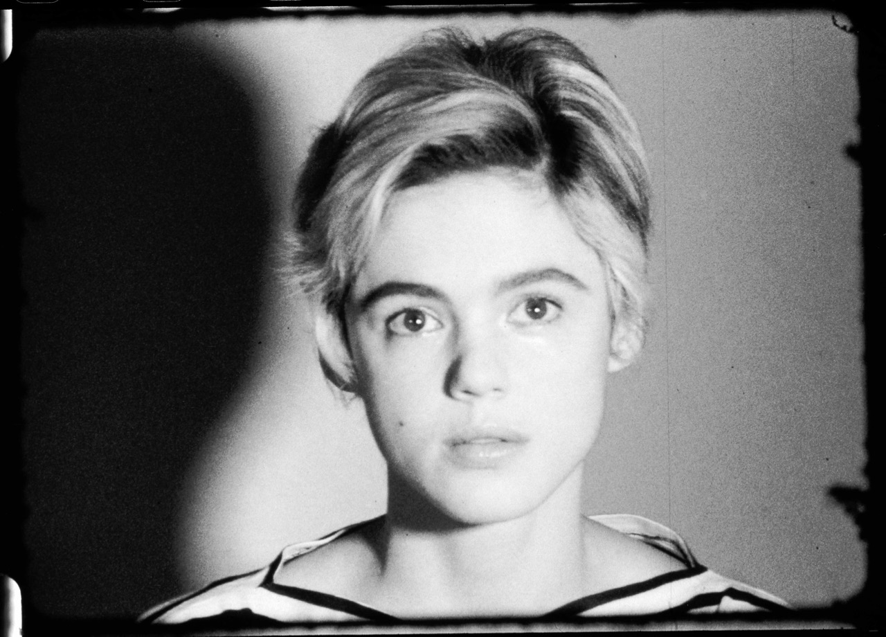
Comprising over 350 works, the exhibition presents, in roughly chronological order, paintings, drawings, and prints spanning the artist’s trajectory, from 1948 to his untimely death after gallbladder surgery in 1987. But while hardly small, it feels insufficient given Warhol’s importance and the vastness of his output. The Whitney retrospective fills important gaps, particularly in presenting rarely seen early work from the late 1940s and 1950s, but ultimately offers more of a glimpse than a full picture of Warhol post-1960s—and one that misses significant aspects of his production during those years.
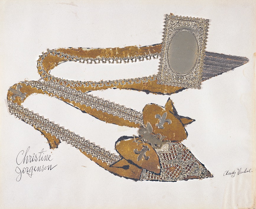
Andy Warhol, Christine Jorgenson, 1956. Collaged metal leaf and embossed foil with ink on paper, 13 × 16 inches. © The Andy Warhol Foundation for the Visual Arts, Inc. / Artists Rights Society (ARS).
Andy Warhol—From A to B and Back Again starts with Pop and then backtracks to a gallery devoted to the artist’s earliest work. The selection of drawings and designs on display is exquisite, not only in terms of the odd beauty of most of the images, but also in how efficiently they indicate the multiple ways the artist’s mature work is prefigured by the experiments of the younger man: the metallic backgrounds of the sixties are announced by the constant use of gold and metal leaf; dollar bills show up as props in drawings of the feet of friends and acquaintances; the obsession with copying newspapers that will stay with him to the end is already in place by 1956; the curiously ornamental, jewel-like penises will return in the farcical nudes of the 1970s. And we become convinced that the transition from the early, hand-painted works based on newspaper ads and cartoons to the silkscreened canvases that followed was more deliberate and gradual than the myth of the graphic designer who magically transmogrifies into a Duchampian avant-gardist would have us believe.
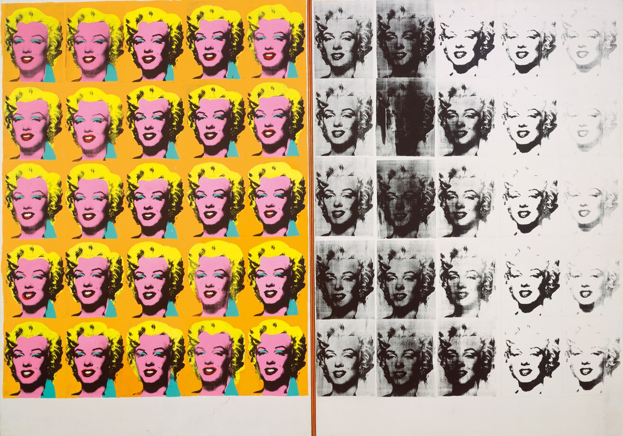
Andy Warhol, Marilyn Diptych, 1962. Acrylic, silkscreen ink, and graphite on linen, two panels, 80 ⅞ × 114 inches. © The Andy Warhol Foundation for the Visual Arts, Inc. / Artists Rights Society (ARS).
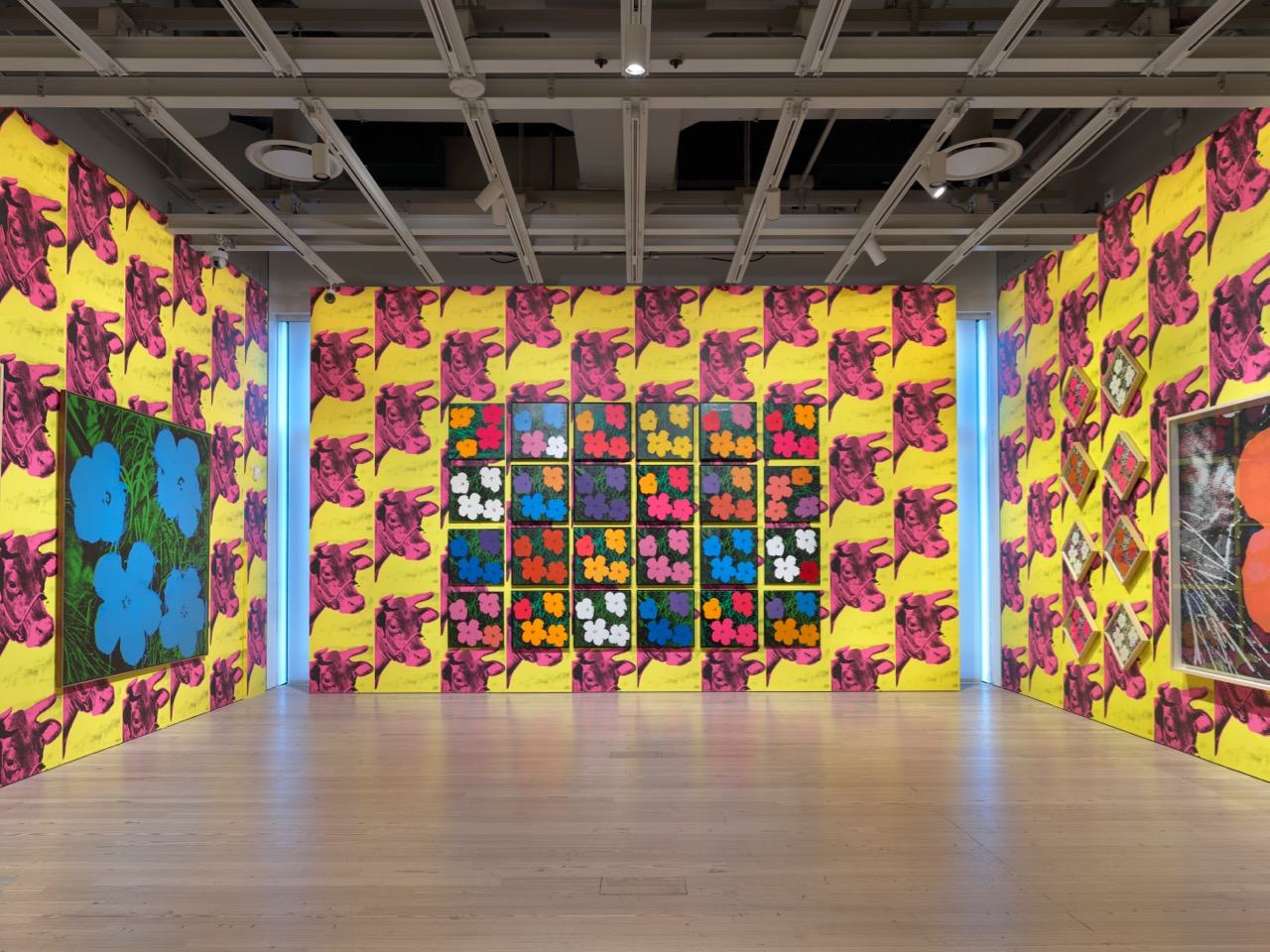
The work from the early 1960s on display is, of course, fabulous. There are some surprising absences that are hard to explain except for conservation issues or the inability to secure loans. I’m thinking of the crucial Gold Marilyn (1962), now at MoMA, but the presence of the Marilyn Diptych of the same year fully compensates for this. Some series seem underrepresented (the Lizes, the Jackies), but the room devoted to the Death and Disasters series is stunning, as is a beautiful installation of a set of Flowers from the mid-sixties hung as tesserae of a mosaic over the Cow Wallpaper that was first shown at Castelli Gallery in 1966. This is the closest we get at the Whitney to the artist’s preferred way of displaying much of his work: not as a set of singular objects meant to individually capture and sustain the viewer’s attention, but as saturated and blurry environments that disperse it.
Andy Warhol—From A to B and Back Again, installation view. Photo: Ron Amstutz. © 2018 The Andy Warhol Foundation for the Visual Arts, Inc. / Licensed by Artists Rights Society (ARS).
The abundant collection of printed materials and visual documentation on view in several vitrines hints at the staggering variety of activities in which Warhol was involved. By the mid-sixties, film was the most important of them. In 1965 he announced he would abandon painting, and for a few years he more or less did. But his different areas of practice are very closely linked: the Warholian method was essentially the same in painting, film, or text. Andy Warhol—From A to B and Back Again attempts to integrate film into the flow of still images through a room that shows a handful of short movies, mostly screen tests. It also includes a film series screened in a separate auditorium. This is an unmissable opportunity to see in their original, 16mm format not only the early tours de force (Empire, Sleep, Blow Job), but also some of the lower-profile collaborations with Ronald Tavel (The Life of Juanita Castro, Vinyl, the extraordinary Hedy) and three extended portraits of Edie Sedgwick (Poor Little Rich Girl plus two double-screen movies, Lupe and Outer and Inner Space). A recent series at MoMA did a great job at presenting The Chelsea Girls, one of the high points of Warholian cinema, but it would have been nice to see it again in this context, particularly since the experiments with color that are characteristic of the late-sixties painting (represented in the galleries by, for example, a pair of electric chairs and a small self-portrait) have such a huge debt to The Chelsea Girls and the films that came in its wake. Given the ambition to reevaluate areas of Warhol’s work that have been previously neglected, I find it disappointing that his post–Chelsea Girls cinema, an unjustly maligned corpus of comedic explorations of actual and potential forms of masculinity (I, a Man; Bike Boy; The Imitation of Christ), is almost entirely ignored.
Andy Warhol, ST309 Edie Sedgwick, 1965. 16mm, black and white, silent; 4.5 minutes. Pictured: Edie Sedgwick. © 2018 Andy Warhol Museum. All rights reserved.
The show acknowledges the existence of a brief series of experimental projects that Warhol, not always successfully, attempted between the late 1960s and the early 1970s: an enigmatic 1970 construction made of plexiglass and mylar, and the intriguing performance in which Warhol, who was always fascinated by maids, vacuum cleaned the floor of the gallery for a collective show at the Finch College Museum of Art. One photograph and a copy of the catalog are dedicated to Raid the Icebox, I, a show curated by Warhol in 1969 for the Rhode Island School of Design. Invited to design an exhibit with objects from its collection, the artist raided the storage room of the school’s museum and brought into the open hundreds of carpets, which he displayed in piles; rows and rows of shoes, which he placed in slightly worn-out cupboards; umbrellas and chairs, which he hung from the ceiling; and paintings that he piled over other paintings on the floor.
The brevity of attention paid to Raid the Icebox, I is strange, given that this show is not only one of the earliest examples of the kind of institutional intervention that has become a major area of artistic practice (a precursor as important as the roughly contemporary projects of Marcel Broodthaers), but also a crucial link between the two decades of Warhol’s oeuvre. Raid the Icebox, I is also a reminder that—at least until the late 1970s—the artist put enormous care into the design of his exhibitions. The operative principle he applied was always the same: he favored clutter over sparsity, interference and noise over distinction and clarity—or quantity over quality, as Thomas Hirschhorn, his follower in more than one aspect, would put it.
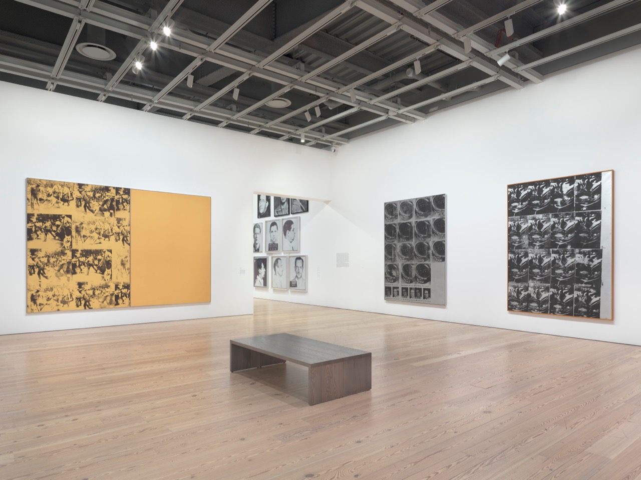
Andy Warhol—From A to B and Back Again, installation view. Photo: Ron Amstutz. © 2018 The Andy Warhol Foundation for the Visual Arts, Inc. / Licensed by Artists Rights Society (ARS).
This was the case in two great surveys of his work in which he was directly involved: a show in 1968 at the Moderna Museet, Stockholm, and the traveling retrospective that culminated in 1971 at the Whitney in New York. In both cases he required that the show be restricted to a small selection of series, and that a large number of pieces from each series be exhibited. He famously covered the walls of the Whitney with the Cow Wallpaper to provide a suitably strident background to his portraits, accidents, flowers, and boxes. When asked why he displayed his paintings this way, he said: “We fixed it like this so people could catch the show in a minute and leave.”
Andy Warhol, Elvis at Ferus, 1963. 16mm, black and white, silent; 4 minutes. © 2018 Andy Warhol Museum. All rights reserved.
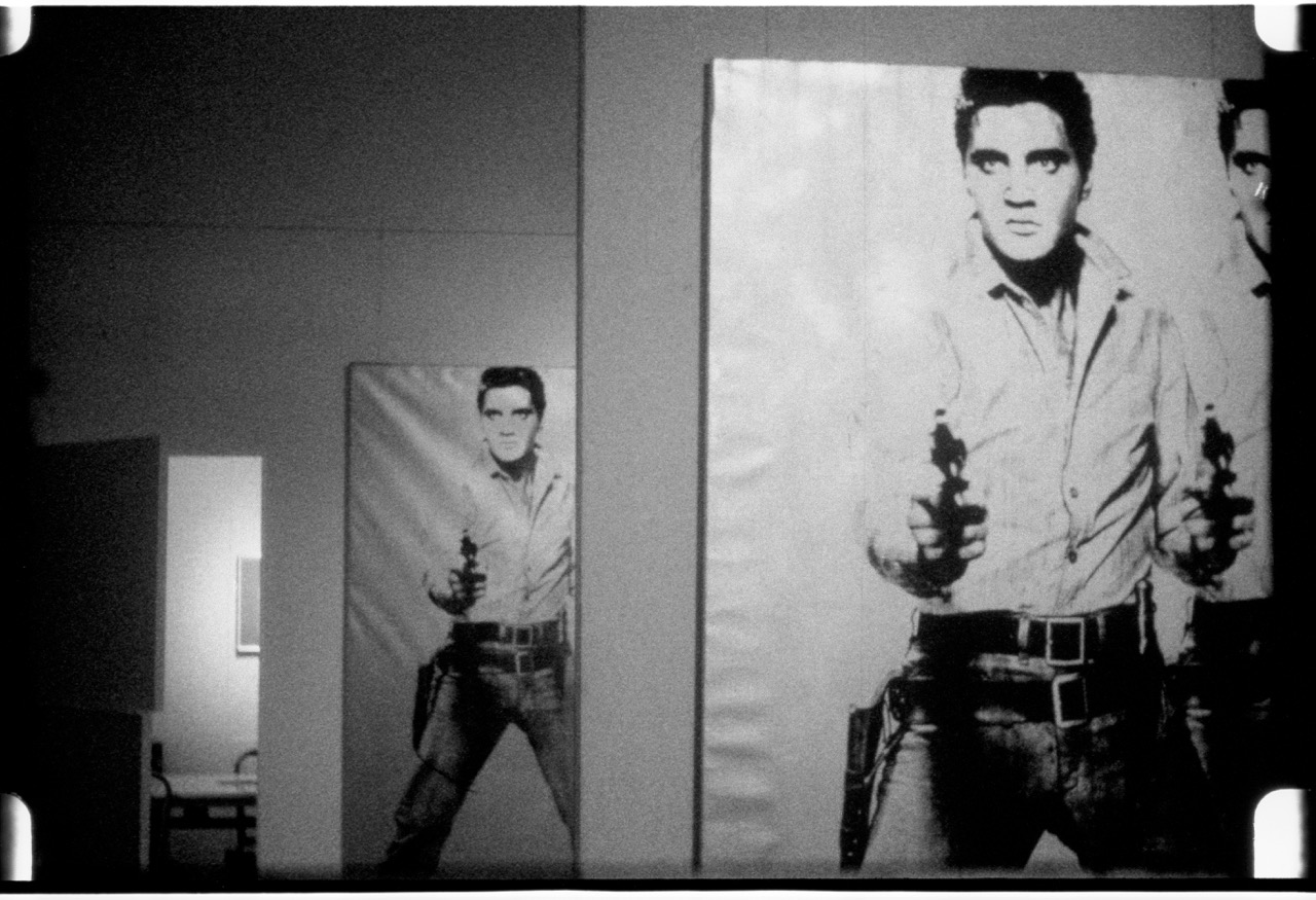
It could be argued that from almost the start of his career, Warhol’s project was less the production of singular artworks than of exhibitions or mise-en-scènes. Already in 1963, a show at Ferus Gallery consisted exclusively of repetitions of the same image of Elvis pointing a gun at us; photographic documentation shows the extent to which the effect was akin to having an “Elvis wallpaper” that turned the gallery into a version of the mirror funhouse in the ending scene of Orson Welles’s The Lady of Shanghai. In 1964, stacked wooden replicas of Brillo, Kellogg’s, and Campbell’s boxes filling the space at the Stable Gallery were not so much things to be looked at as obstacles to negotiate. Even the soberer Portraits of the 70s, shown at the Whitney in 1979, had walls painted a fecal brown on which pair after pair of portraits hung, forming a frieze around a space dominated by a sort of shrine built for three monumental Maos. The Shadows—102 panels made on the basis of photographs of the shadows cast by two maquettes—which Warhol installed in Soho at around the same time, wrapped the space to form what the artist called a “disco decor.” About half of them are hanging right now in the headquarters of Calvin Klein on Thirty-Ninth Street. Unfortunately, the architecture of that space precludes the deployment of the work in its full power: interrupted by four massive columns and by doors in the corners, the piece doesn’t give the sense of an infinite modulation that one will be able to discover when the series is reinstalled at Dia: Beacon next year.
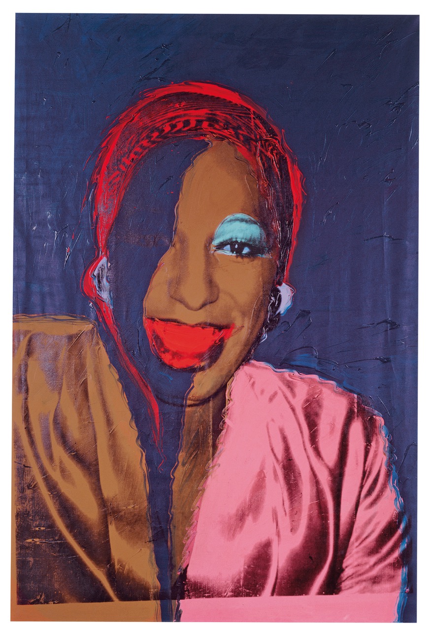
Andy Warhol, Ladies and Gentlemen (Wilhelmina Ross), 1975. Acrylic and silkscreen ink on linen, 120 × 80 inches. © The Andy Warhol Foundation for the Visual Arts, Inc. / Artists Rights Society (ARS) New York.
Sadly, we can have no hope of ever seeing an even remotely approximate reconstruction of Warhol’s most ambitious installation of the 1970s: the Mao series at the Musée Galliera in Paris (1974). On that occasion, Warhol occupied virtually the entirety of the late nineteenth-century, beaux arts Palais Galliera with over one hundred paintings based on the most famous portrait of the Chinese leader. Nor have we a way to reconstruct the first and most comprehensive exhibit of the Ladies and Gentlemen, where the artist used 105 paintings based on photographs of (mostly) Latino and black drag queens to fill a brief series of rooms of the Palazzo dei Diamanti, in Ferrara, Italy (1975). In order to produce the large number of images that both of these projects required, Warhol put into practice a laborious procedure: he would paint a small number of monumental canvases, a larger number of medium-sized images, and an enormous number of small panels (for the Mao series, he also executed a fourth size). He would work fast and refuse to revise the results. It is as if the process was pushed through an accelerating device, with the latest (and smallest) instances of vertiginous blurs, feats of misaligned contours and mismatched tones. The artist gleefully defaces his subject, as a makeup artist who, carried away by enthusiasm, loses all sense of the purpose he’s supposed to serve.
Andy Warhol, Empire, 1964. 16mm, black and white, silent; 8 hours, 5 minutes. © 2018 Andy Warhol Museum. All rights reserved.
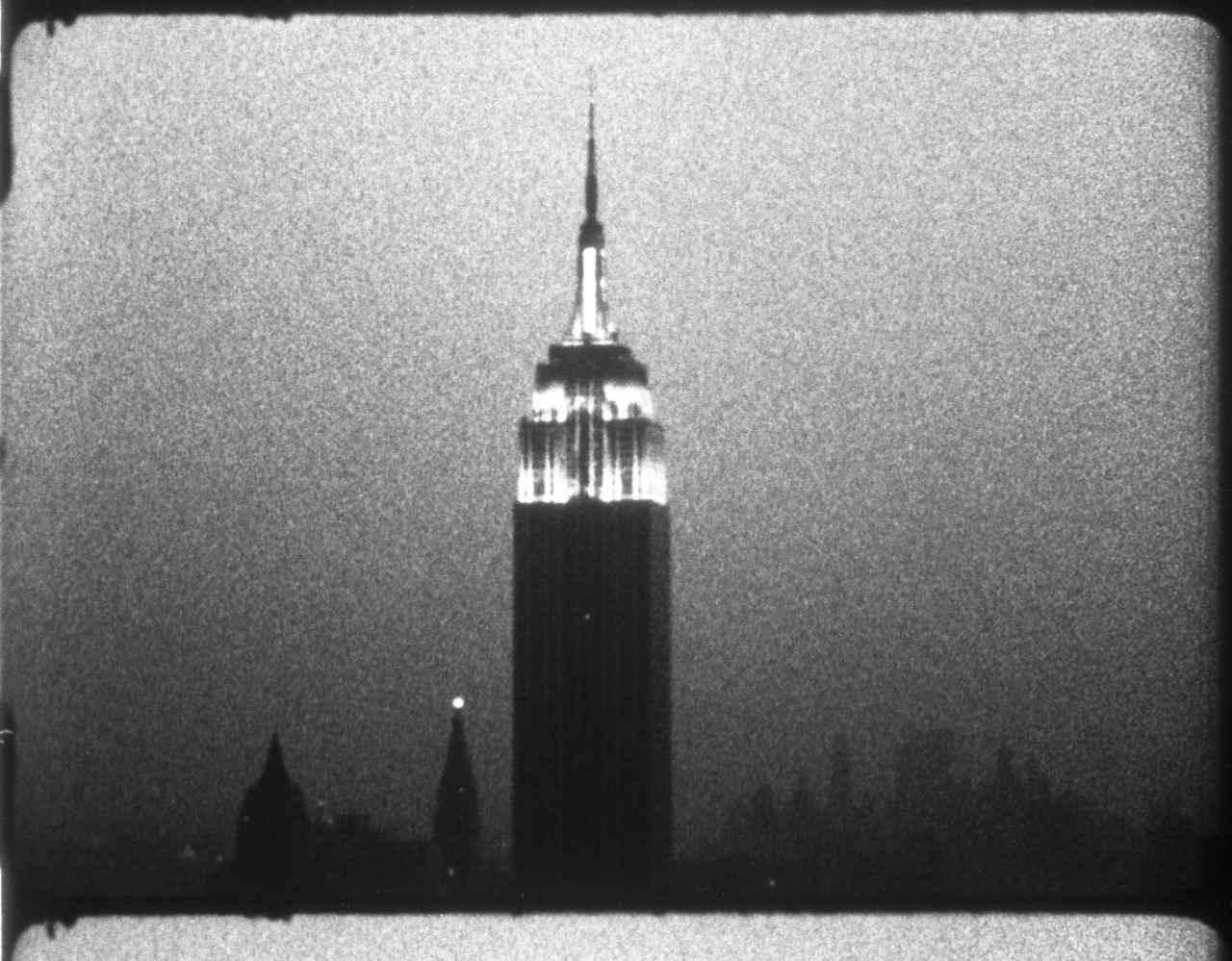
Warhol always liked to stage a blurring of images that bordered on their obliteration. At the Whitney, this impulse can be gleaned from the 1962 Marilyn Diptych, where the countenance of the actress, a vivid mask in the left border of one panel, turns by degrees into a faint trace on the other one. It is perhaps even more forcefully present in Lavender Disaster (1963), where the electric chair of the source photograph is gradually encircled by black. The scheme returns in the last room of the survey, in the monumental Sixty-Three White Mona Lisas (1979), where the diva’s face oscillates between visibility and invisibility for the thirty-five feet of its extension, to end up submerged by gestures in white. (For a filmic version of the scheme, you shouldn’t miss Empire, 1964, where the volume of the building is turned into a spectral, unstable figure of light, to be extinguished in the dark of the last hour or so.)
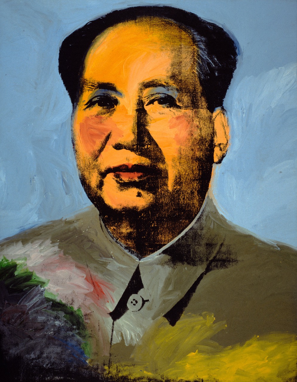
Andy Warhol, Mao, 1972. Acrylic, silkscreen ink, and graphite on linen, 14 feet 8 ½ inches × 11 feet 4 ½ inches. © The Andy Warhol Foundation for the Visual Arts, Inc. / Artists Rights Society (ARS).
If these are some of the pieces that work best at the Whitney, it’s because they restrict to a single canvas the same dynamics of disintegration and dispersal that the Mao series carries across almost two hundred paintings. Besides a wall covered with Mao Wallpaper (1974), the Whitney retrospective includes only one painting from the series (a monumental one), a drawing, eight color screenprints, and a group of eight images selected from a series of three hundred increasingly unrecognizable photocopies of a hand-traced Mao. The absence of examples of the smaller, more experimental painted panels makes it impossible to appreciate the most carnivalesque and baroque aspects of this extraordinary project, and some of its deepest links with the best of Warhol’s 1960s work.
There is a circular logic at play in the decline of Warhol’s critical standing post-1960s, which took place in a still New York–centric art world. As New York outlets for his work diminished, Warhol increasingly turned to European venues. As a result, the major projects of the 1970s were not seen (or only seen in partial ways) in New York and thus could not be properly assessed by its tastemakers. Consider, for example, the case of the Still Lifes (1976–77), a project split in two parts: one a set of hammers and sickles, the other a set of skulls. They were conceived in and meant to be presented in Italy, where the references to both communism and fascism, whose emblematic image was a skull, would have been viscerally evident, particularly given the political violence of those “years of lead,” punctuated by outbursts of extreme and sometimes inexplicable violence from the far left and the far right. When Warhol attempted to show the series together in Italy, he couldn’t find a gallery or museum willing to take the risk, so a selection of hammers and sickles found its way to Castelli Gallery, for one of his few big New York shows of the decade. Andy Warhol—From A to B and Back Again has two large Hammer and Sickles and four magnificent Skulls, but—hanging far away from each other on opposite sides of a gallery that they share with one Oxidation Painting, one late Self-Portrait, and three Shadows—the relationship between them and their political context is left obscure.
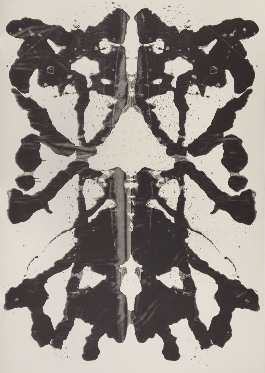
Andy Warhol, Rorschach, 1984. Acrylic on linen, 13 feet 8 inches × 9 feet 7 ⅛ inches. © The Andy Warhol Foundation for the Visual Arts, Inc. / Artists Rights Society (ARS).
The positioning of the two Hammer and Sickles next to a large red-and-black crucifix, a gun, and a double self-portrait (with skull), while making sense formally, conflates two different moments in Warhol’s work. Crosses and guns (like his contemporaneous knives and dollar signs) are a response to the modified landscape of the country in the early 1980s, with the ascent of random violence, neoliberal economics, and the religious right—an artistic reaction that he rendered not in the brilliant tones of much of the 1970s work but in increasingly funereal hues. There is often a somber, gelid quality to the later work, represented here through a series of monumental paintings: the curiously menacing Rorschach series (1984) and the Camouflage Last Supper (1986). Unfortunately, another monumental work—rendered in the tracing technique Warhol adopted in the mid-1980s—AIDS, Jeep, Bicycle (c. 1985–86), is only included in the catalog. Its presence at the Whitney would have underscored the way that this period of work is marked by the rapidly evolving AIDS crisis, which in 1986 claimed the life of his last durable lover, a film producer named Jon Gould.
If notable for the openness with which it treats Warhol’s homosexuality, the show shies away from his frequent and deliberate vulgarity—both the raunchiness of Warhol’s erotic sensibility and the complexity and depth of his engagement with celebrity. As is well known, Warhol was fascinated by the disco-driven celebrity culture of the 1970s, whose flames he helped to fan through his involvement in Interview, the magazine he founded. He also recorded this culture by adopting the pose of the kind of photographer he professed to most admire: the paparazzi. His photographs capture the rich, the famous, and the sexy in their moments of ugliness, flattened and burned by the light of a flash, from the point of view of an intrusive observer in precarious balance, who has no time to focus or frame. The same taste for the rudimentary, the amateur, that is a central component of his cinema and painting is mobilized in the 1970s photographs to register a world in which the mechanisms of fame melt together the previously differentiated social systems of art, politics, and sports into a uniform and lethal solution. This is, of course, the prehistory of our time, and Warhol was its greatest visual chronicler. The books on view where he gathered his photographs (Exposures, America) are confined to vitrines; we can barely glimpse their contents. It is true that these photographs (at times seemingly indistinguishable from those found in People magazine) are difficult to like—as difficult to like, perhaps, as those movies of the late 1960s that have been excluded from the film program, or the also excluded garishly painted and violently cropped nudes of the late 1970s, works that complement the brutal print series Sex Parts, four of which are displayed here.
A byproduct of the relative brevity of the exhibition is that it becomes difficult to follow the sometimes drastic twists and turns in Warhol’s post-1960s pictorial technique: the hyper-fluid brushstrokes of 1972, the heavy impastos of 1975, and the washed surfaces of the end of the decade, changes through which one thing, however, remains constant—the artist’s resistance to conventional virtuosity, his systematic refusal to exert anything resembling quality control. When he was asked how one should paint, he responded that the idea was “to get things done quite quick. The sloppier it is the better . . . just be sloppy and fast,” and he liked to compare his performances as a painter with those of Julia Child’s as a cook. In the Factory of the mid-sixties, movies were shot without time for rehearsals, and no editor excised the frequent faux pas of the performers or the technical shortcomings of the staff; similarly, in the 1970s a monumental Mao had to be completely painted in a half-hour, while the smaller canvases must have barely taken a few minutes, colors decided on the fly and dissonances left where they fell. In the Ladies and Gentlemen, contours are traced with the fingers, following a technique most commonly associated with the work of children, and, later in the decade, in the Skulls and the Shadows, backgrounds are splashed with a sponge mop. The occasionally sublime results never entirely obliterate a clumsiness that Warhol found tremendously attractive. His highest term of praise was “funny,” as in “a funny joke” (and we have to always remember that Warhol’s art is almost always comedic), but also as in “feeling funny”—uneasy, vaguely sick. He pursued this association of exhilaration and disease all his life. It makes sense that the same year he was painting the Still Lifes, he would show in the Museum of American Folk Art his collection of crafts with the title Folk and Funk. The inheritors of this Warhol—who would profess his love of rug weavers and quilt makers, of the assemblages made of discarded wood and plaster by Louise Nevelson, and the books, murals, and textiles of the late Henri Matisse—are less Koons, Hirst, and Murakami than, say, Mike Kelley and Rosemarie Trockel, Rachel Harrison and Mark Leckey.
We should be grateful for the enormous intelligence and effort invested by the people responsible for Andy Warhol—From A to B and Back Again. We need to welcome both the force with which the curator makes a case for the continuous impact of Warhol on American culture, within and beyond the art world, as well as how convincingly the show traces the roots of his best-known period to the 1950s, and the evident—although at times inert—beauty of the later work. But we should remember that there’s another, stranger Warhol still to be discovered: the former window dresser who was more concerned with the design of immersive, typically overwhelming environments than the production of discrete objects; the ethnologist whose passion for social systems led him to both promote the formation of anomalous collaborations around the successive studios he set up and to obsessively register the comings and goings in the bathhouses and clubs of the 1960s and bars and discos of the 1970s; the admirer of paparazzi, directors of pornographic movies, authors of gossip columns and self-help manuals, whose forms and mannerisms he appropriated; the photographer as ominous witness who operated at the closest possible proximity to the subjects he stalked, waiting for the moments when the masquerade collapsed.
Reinaldo Laddaga is an Argentinian writer based in New York. The author of numerous books of criticism and creative nonfiction, he taught for many years in the Romance Language Department of the University of Pennsylvania. He has just completed the manuscript of a book about Andy Warhol: Cortes y confecciones: Introducción al método de Warhol.